Friday 18 October 2013

Final work

This is my work for this assignment.

I wanted to draw this subject as someone who is important to me, and in this pose they are doing something important to them - praying.  

In setting up the pose I decided to keep the background simple so as not to detract from the subject.  I added an extra light source coming from the front righthand side.   I had enjoyed the tonal studies in this part of the course and so decided to use conte crayon and charcoal, I am most confident in working with this media and they have a flexibility about them that I like in that you can overlay and manipulate them.

In terms of preparation, I first did a quick colour sketch of the subject in this pose, using my chosen media, in order to demonstrate to myself that I could achieve my end aim.

I then took a photograph of the chosen pose from which I could work out where to place the subject on my paper and prepare an initial light pencil sketch in preparation for the first sitting.  I did this in order to bypass this part of the process at the first sitting.  In the end this idea didn't turn out as useful as I had hoped.! Before the first proper sitting I also worked out a colour palette.

At the first sitting I got the model into the same pose and in part relying on my initial pencil sketch I began to draw using conte crayons, making alterations along the way.  In this first sitting I managed to get quite far with the image.  I arranged one further sitting to work on detail.   At the end of the second sitting I took a photo of the subject so that I could do further detail work from the photo in my own time.   It was only after the second sitting that I realised I had focussed so much on the face and not realised that the hands and arms were wrong and out of proportion.   I think doing the initial pencil sketch from a photo was a mistake. In the first proper sitting, a slight variation in position despite best efforts to replicate the photo, meant that the hands were in a slightly different position in relation to the head and yet I was led by my initial sketch.  I didnt check this until late in the process and it meant I had to go over my initial drawing of the arms and hands with many layers of conte and much spraying of fixative.  Lesson learnt!

With the background, the Modigliani portraits inspired me to make them simple and warm.  I enjoyed working on the face mainly and working on it until I got it as right as possible in my view.  Because of the issue over the upper body I really struggled with the jumper and the arms.  I feel the hands worked out even though they don't have the same subtle finish of the face. I would have liked to have managed to get a similar, rougher, less smooth effect on the face but I was worried about ruining what I had already achieved if I kept working on it.

In conclusion I think my portrait is ok.   However it is far more formal and 'realistic' than I wanted to achieve and I was unable to achieve the free expressive style that I would have liked.  I want to be more expressive in my style and I think that will hopefully come as my confidence with drawing builds.  The only way is to keep practising.

Research Point - Look at the work of a range of artists and their use of line

Source : www.nationalgallery.org.uk

Jean-Auguste-Dominique Ingres  1780 - 1867

Ingres was steeped in the academic tradition. He became the defender of a rigid classicism, seeing himself as a history painter, the highest goal of academic art.  He saw himself as a   conservator of good doctrine, not an inventor.  Portraiture he thought of less importance, but by the end of his life it was Ingres's portraits, both painted and drawn, that were recognised as his greatest legacy. 


I came across a paper titled Drawings by Ingres by Louise Burroughs, Assistant Currator of Paintings at the Metropolitan Museum.   It focuses on seven pencil drawings by Ingres.  Of these I have picked the following of interest.


Below is Portrait of a Lady Seated, by J. A. D. Ingres. Dated 1814. Ingres appears focus on the face in terms of ‘finishing’ the drawing by adding some tone.  Whereas the rest of the drawing relies solely on line. To me this has the effect of directing my eye to the face alone and almost disregarding the rest of the drawing.  I don’t think this matters – its just what happens when I look at it.

Portrait of Ursin Auguste Vatinelle (1798-i88i), by J. A. D. Ingres. Dated 1820.  This is more freely drawn than the earlier dated sketches in the group.  Again it seems to me most attention is given to the face.  Here he has strong light and dark tones which I think adds more interest.


To digress a little.  What interested me most from this paper was the struggle the artist had in drawing a study of for the Portrait of Louis Francois Bertin (1766-1841), by J. A. D. Ingres. Drawn in I832.   See below: 
Bertin was the owner and publisher of an influencial publication in whose pages literary and artistic talent was welcomed and encouraged. The subject was himself a great admirer of the arts and a warm friend to artists. Ingres was enthusiastic about the commission.  After deciding on the pose, (not being the final pose above) innumerable sittings, sketches were made and the painting begun. That the sketching process gave the artist trouble is indicated on initial sketches by the much rubbed drawing of the head inserted in the paper where another must have been cut out. Perhaps Ingres was too anxious-perhaps his early dissatisfaction with the sketch unnerved him. In any case, after many days had been spent upon it, Ingres in despair was obliged to confess to Bertin that all their time had been wasted, that the portrait was past reclaim and would have to be commenced anew. Bertin was understanding and they agreed to a breathing spell before trying again.  One day during this breathing space, Ingres observed Bertin seated, leaning slightly forward in his chair with his hands out-spread on his knees, engrossed in conversation. Instantly the artist was filled with confidence and took the first opportunity to whisper to Bertin: "Come pose tomorrow. Your portrait is done." The sittings were resumed, and within the month one of the artist's most successful portraits was completed.
The reason this story interests me is that even for artists such as Ingres that posess such great artistic and technical skills, sometime is it take more than that to inspire a drawing.  I also read that Ingres would usually complete a drawing in four hours, taking one and a half hours in the morning and then two and a half hours in the afternoon.  But that he would also have lunch with the subject of his drawing and this way would manage to see them as they naturally are and not in any particular pose.  A particular mannerism or stance can really capture the person being drawn and its important to take this into account, to know something of your model, when drawing them in order to get a true likeness.

Hilaire-Germain-Edgar Degas  1834 – 1917


Degas specialised in scenes of contemporary life in his time, including dancers, entertainers and women at their toilette. His drawings show that he only sought to master his technique; he experimented with various media including pastel.

I have chosen the following three images by Degas which I like and which demonstrate clearly his drawing style.  I see a connection here with the previous work I mentioned by Giacometti, ie that Degas really focuses on the subject and keeps working and reworking the image to get the feel of the action or moment.    I like the idea of studying and working an image rather than the aim being to produce a final picture.  These types of drawings show more about the process the artist goes through and by being able to see the workings it helps the viewer enter into that process.


In this image I love Degas' use of pastel which is simple and bold.

Assignment five, Option 4 - Drawing figures

Review of past figure drawing work


Looking back over the work from Part four of the course, Drawing figures 

Quick sketches:
-         When drawing the quicker poses I found it natural to look at the image as a whole to see where it was placed in relation to markers in the background, eg a chair or table, and how one part of the body was in relation to another in terms of its position, alignment, size, angle.  I found this helped me to achieve  reasonably accurate proportions.   It was not, however, natural for me to use the medium as a measuring tool, but it became more second nature the more I drew.  

-         Initially I wasn’t always placing the figure correctly on the page, so I took it that drawing from the middle of the page as advised may have helped with that and tried to remember that going forwards.

-         I did enjoy trying to capture the figure in a quick sketch, I felt the limit on time helped me focus and really go for getting the whole figure captured and I was able ignore too much detail.  Sometimes the time pressure helped, but other times it didn’t!  I did like trying to capture the form with just line and no shading and sometimes I would manage to capture the character of the person in a very simple way.

Longer poses
-         Here I focused more on establishing form through light and dark.  Longer poses allowed me to go slower, to break down the figure into shapes before going over it again and establishing more of the individual character through line and tone.  More time also enabled me to slow down and get used to measuring the proportions of the figure as I went along.  I also found it a useful tool to establish the angle of the central axis when drawing figures in different positions, particularly if they were twisting or leaning in some way.

Form/Essential elements
-         Initially I found it hard to do a quick drawing focusing on tone rather than line. I established an approach which involved laying down basic geometric shapes, then adding some contour line to create a more realistic shape and then enhancing the form through shading.
-          I learnt that certain poses which involved a more defined pose eg bent or crossed legs, helped in getting the best sense of the pose, rather than if the model was just lying or sitting.

Gesture, stance and energy
-          To quickly capture a stance or gesture I found it invaluable to first establish the central axis.  From this I could see the true stance much more clearly, even if it was subtle.  I also used the central axis when looking to capture an action or energy, plus I found it helped to really focus on the action going on, when trying to draw it.

Of my work from part four, I feel most strongly about my self portrait for a number of reasons:
I was immediately inspired when I saw the book of etchings by Lucien Freud as to how I wanted my portrait to look.  To find that inspiration really helped me by giving me a confidence in what I was aiming to achieve and it helped to have that focus in my approach to the drawing which then wasn’t just about getting a likeness but was also about achieving a style of drawing.    I was inspired to create a self portrait using rather minimal but key and effective mark-making.  I liked the idea of establishing key proportions and features of the image first and then using my chosen medium to building up the image using sparing marks.  I wanted to achieve a portrait of myself which actually showed a likeness and yet had been achieved very simply.


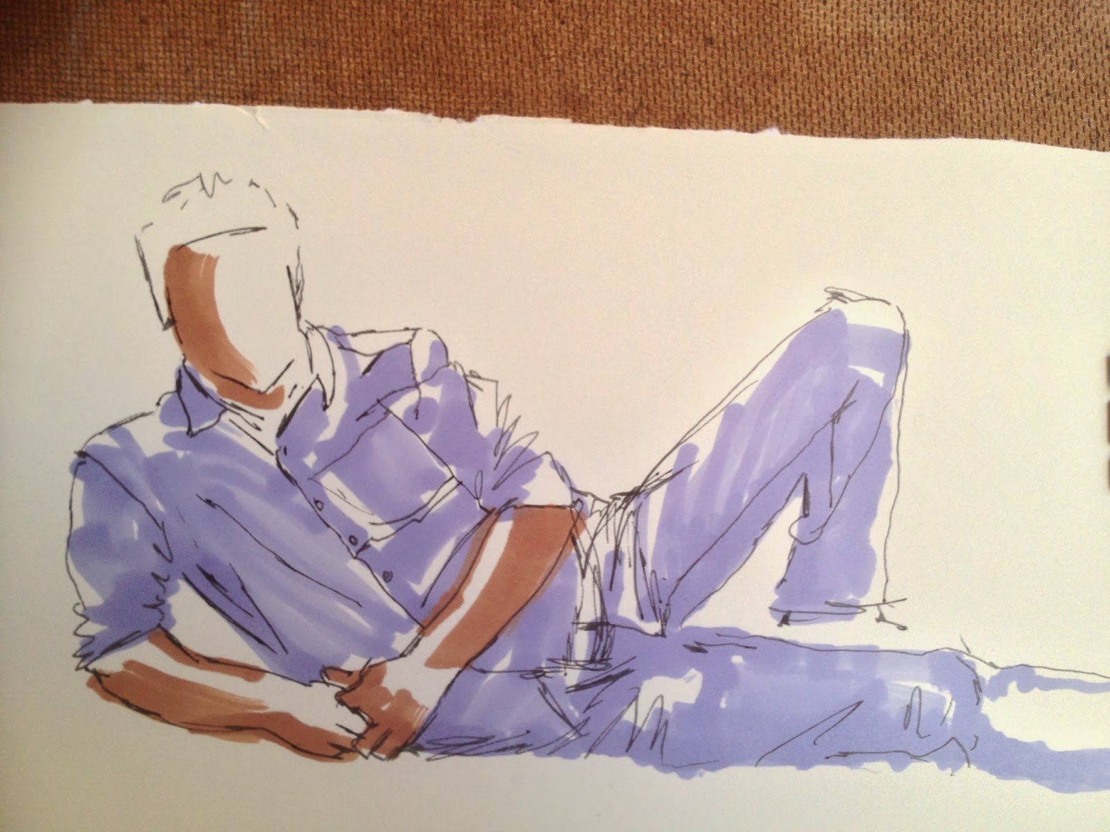
1.    I also enjoyed the simplistic approach of the sketches I did for the exercise ‘Form and movement in a clothed figure’  using pen and ink and coloured marker pen.  I would like to play more using marker pens and maybe using more colours which I overlay to get interesting effects with tone.


1.      In one of my final pieces where I drew an image focusing on tone, I felt confident using charcoal as a medium and as I feel confident with it and enjoy using it I feel that I should continue to explore its use with the aim of improving my skill in this area.


What I would like to achieve with assignment 5
From the point of picking this option I knew I wanted to do a portrait of some sort.  I spent some time visiting galleries and thinking about the artistic styles I like.  I have always liked the portraits of Modigliani.  This exercise made me think about why I like his style of portrait.  Below are some examples:

 I simply like them.  They are warm, different and distinctive and full of character.  In a way they are a bit like a caricature which emphasises something about the subject.  But I find this a adds life and interest. It is more than a straightforward portrait.  The works portray a type of beauty whoever the subject is.  They seem to me to portray a sense of life and maybe glamour, which was probably very far from how he and his models lived.  I think its like looking at life through slightly rose tinted glasses
!

Another work I recently saw at Tate Modern is the Seated Man 1949 by Alberto Giacometti.  It was written next to this piece that Giacometti's portraits emerged from an intense scrutiny of his subjects, and a process of continually reworking the image in order to record his shifting visual impressions. For want of a better word,  I like the 'messiness' of it!  To me it portrays a sense of freedom in the drawing process, like he focusses on the subject more than anything else and less so the precision of his drawing.  I aspire to gaining the confidence to be so free in my drawing


At the National Portrait Gallery there was an exhibition of portraits by Bob Dylan.  Here below are two examples.  I liked the simplicity.  That he focused on tone and then very free lines.  I liked them and saw depth in them despite their apparent simplicity.  I noticed that mainly he would use a very limited black/grey/white palette but also the tiniest hint of another colour and that touch would bring the image alive.


I was also interested in the following portrait by Frank Auerbach.  I have notice the work of Auerbach in the past and have found it interesting that he takes a long time over the production of works that, because of his style, could be perceived as having been done quickly.  I am interested in the creative process he goes through.

In my work for this assignment I would like to achieve a freedom in expressing the essence of the subject rather than being concerned about achieving a visual likeness.  


Thursday 17 October 2013

Using colour and Tonal Studies

'Using colour' and 'Tonal study' were two separate exercises in the course work.   I have put them together in this section as I feel that some of the work I have done seems to overlap the two exercises.  So below I have a selection of work and accompanying explanations.

In the drawing below I drew the figure feintly with pencil.  I then added blocks of colour with conte crayon and finally using the initial pencil drawing as a guide, I added a strong charcoal line to give form to the figure.

Below is a large but quick study using conte to draw the line straight off and then add colour and some tone to help give form.  

Below is a quick tonal sketch using simple wax crayon.  I hatched and let the white paper be the lightest tone or highlight.


The study below I did on coloured Ingres paper.  I used soft coloured pencils as the medium. The colour of the paper actually became the lighter tone as didn't use any lighter coloured pencils.  For the body I used one colour of pencil and used hatching to achieve degrees of tone.  It was a quick study and I see that I could have added more tonal variation to the image.


For the study below I used Conte, charcoal and chalk. I focussed on the model's back (and I don't think I got the legs very well proportioned) but I like the tonal effect I achieved on the back.  I put a strong defining charcoal line around it - I do note this can sometimes help with a quick sketch to achieve the contour but sometimes it may overpower and detract from the subtlety of the tonal work.

Below is a larger 'back' study.  I think the strong tones depict strength but there is always a danger if trying to be expressive and free with tone using conte that I can put too much colour on and then it can get hard to lighten up areas that get too muddy and dark.


The two studies below are small scale but I managed to capture the subject as she can lie when relaxing.  The first was in charcoal which really lends itself to a tonal study.  For the second I used crayon, just childrens crayons so not artist quality. I used an orange and orangey brown for the skin and grey and white for the clothes.  I built from light to dark with the crayons; they are not so easy to use as they are hard to layer with and you get blobs of crayon after a while if you try and lay it on too much.  I liked doing two similar poses in two different media as it demonstrates how you have to change your approach to achieving a tonal study depending on the media you use.  It also shows how the media used can add a different feel to a drawing.


Line drawing of the whole figure

In these sketches I used the lines of the sofa as a reference point for the figure.  I first used an HB pencil to plot the figure, looking for shapes, referencing each part of the body against another, measuring.  Once I had a light drawing to work on, I used a charcoal pencil to produce a strong line drawing.  Not having to think any more about proportions etc I simple started drawing from the upper body and basically my hand followed my eyes ie as my eyes travelled slowly around the contours of the figure, my hand drew what I saw in terms of form.  The underlying pencil sketch was a general guide but I could make deviations and corrections as I went along as now I was looking at the detail.  During this process my pencil would not often leave the paper except to add small lines of detail within the figure eg short lines to indicate the bones of the ankle, knees etc.  At the end I would add some detail to depict facial features and the fabric of the clothes.

Exercise - Quick Studies

In getting back into figure drawing I consciously reminded myself that I should
- use the background,
- establish a central axis,
- see the subject in terms of basic shapes,
- reference each part of the body against other parts of the body,
- establish correct proportions against the relative size of the head.

In the study below I drew the subject standing, lying and then sitting.  I used one A2 piece of paper and an HB pencil. I  did the sitting pose first and used the background lines of the sofa as a reference.  I looked at the body in terms of different geometrical shapes and  also used my pencil to judge how one part of the body lined up with another, or to establish one angle against another.  I did find it helpful to use the pencil to measure the proportions but do feel that doing this slows me down when I am trying to make a quick sketch - so I also rely on my eye and am more inclined to do a quick check with the pencil here and there.


For the standing pose, rather a simple straightforward pose, it really helped to establish a central axis to see the more subtle positioning of everthing.


I think whatever age of the model, crouching for 10 minutes is nigh on impossible!  I liked this alternative of a figure lying on their side in a curved position.  It inspired me to do more work on the back area of the upper body which I find an interesting part of the body because its is strong and often full of visible bone, muscle and definition.

Below the model’s head was hanging back over the edge of the sofa.  It made me think that poses that stretch and accentuate parts of the body help in the study of underlying anatomy and also are more interesting to draw.


Tuesday 15 October 2013

The work of Jenny Saville and Alison Watt

I found it fascinating reading about Jenny Saville and her work.   I was immediately interested when I found she does larger than life figurative works.  I like her bold way of using paint which reminds me of Lucien Freud’s work.  I liked her courage in producing some very graphic works.  She depicts the reality of bodies of all sizes and in all states.  Her early works of large women were inspired by what she saw when studying in America.  Her later works focussing on the subject of plastic surgery are commenting on today’s attitude towards the female form.  I think she is brave in depicting truths regardless of whether they may be seen as unnattractive.
   
I am really pleased to have been directed to Alison Watt, as I recognised her work from years ago after seeing her on the national news when she was artist in residence at the National Gallery and producing the ‘Phantom’ exhibition and creating massive pieces of work solely focussing on fabric.  I found it really interesting and remember having a go at painting a swathe of fabric right after that !  

Tuesday 23 July 2013

Assignment four

Using line and shape

1. I decided to use chalk-pastel colouring pencils (CarbOthello/Stabillo) and a limited colour palette.  I chose the chalk pencils because as I was aiming for a line drawing and they offered ease of handling and I could achieve single strokes of strong colour.  The colours I used (a dark reddy/orange colour and a black) were deep and dark and robust.  I could get a definite line which would stand alone but I could also overlay the black over the red without a problem.  They would also be possible to smudge/blend a little and if necessary erase a little.
 
2. In terms of setting up the composition, I ensured the model was dressed in close fitting clothes and that I could also see parts of the body.  I didn't do preliminary drawings as such but I did make a couple of attempts at drawing the model in my chosen pose before I was happy with the result.  I had drawn the model so often that I was familiar with my subject, but I did play with the position of the model and the light source - which I placed to the right of the model.   I wanted an interesting seated position with the model doing something that they like doing (drawing) and so it had meaning from that point of view.  The pose says something real about the model and that was important to me rather than have the model pose just for the sake of the drawing.

3. I lay down a light pencil sketch to get the proportions and shapes in place.  My intention from the beginning was to then go over the initial sketch with the red colour - adjusting the proportions as I went along and not worrying about making changes and the initial pencil sketch showing.  Once I was finally happy with the drawing I then went in boldly with the black, again looking at the model as I went over the red lines again making adjustments here and there.  I saw this process as a way of working over the drawing first using the lighter shade of pencil - then red - then black and each time I could make adjustments to the key lines and improve the drawing.  I was not concerned that the previous, less dominant lines, would show underneath - I actually felt it would add a sense of movement to the drawing.

Finally I did add a sense of background and also some of the shadow under the chair in an attempt to 'ground' the image and give it some weight.

 
This is my image using tone:

1. I did attempt this initially with pen and ink but didn't feel I could successfully pull it off and decided to use charcoal which would enable me to add and remove the medium.  I felt charcoal would enable to me achieve the different tones I would need ranging from dark to very subtle and I could depict the softeness of the duvet with the help of a putty rubber.

3.  Again I knew what I wanted to draw, I wanted a nude figure and to include fabric.  I did preliminary sketches in pen and ink but as I mentioned, I knew pretty soon I would find this difficult to use.  I set up the light source and played with the pose to find an interesting but comfortable one for the model and once that particularly enhanced the light and dark.

2. Again I put down an initial sketch with pencil then I built up the image with charcoal pencil, putting in the darkest areas first and blending with a cotton bud.  Once I had built up the dark and lighter areas reasonably accurately, I went in with the putty rubber to get more random light effects over the body and the duvet.  Finally I used the charcoal stick to give a dark contour outline to the figure as I have seen other artists do and I like this effect.   I simply used the side of the stick to put in the wall behind and the bedstead.


- Posted using BlogPress from my iPhone

Self Portraits by various artists + check and log

Self portrait by Durer when aged 13, silverpoint, 1484.
This portrait displays such patience and skill in one so young.  Very precise marks and using silverpoint I think it would have taken a lot of time to build up the darker tones.
 
Self portrait by Rembrandt, 1630.  Using a much looser drawing style, I love this image which makes me think of Rembrandt having to pull this face many times over and over to get the expression.
Frida Kahlo "Self portrait dedicated to Marte R Gomez", 1946, pencil on paper
Frida Kahlo interests me as her many portraits serve largely as a visual autobiography, telling the story and events of her life.   She includes all sorts of signs and symbols in her portraits to tell her story.  In this drawing she has tears rolling down her face.  I don't know the explanation for this but the fact it makes you wonder, makes the image all the more interesting.
 
Check and Log
Which drawing materials produced the best results?  Why?
I am of the view that different drawing materials produce different types of result but I wouldn't place them as better or worse.  It totally depends on what end result you are aiming for.  I wanted a simple graphic look about my portrait and ended up using a black fineliner to achieve that end.
 
Does your self portrait look like you?..  The reason I struggled with this exercise is because I do find it difficult to portray myself in a straightforward way.  I was pleased I managed to achieve the portrait I did as I felt it did look like me.   I asked a friend and they confirmed it.
 
Did you find it easy to convert your sketches into a portrait?  It helped to have done the previous exercise of drawing the basic shape of my face.  It simplified my approach.
 
Were your preliminary drawings adequate? For me they were.  They helped me get a feeling for the facts about my face such as the overall shape.  This helped me when I did the final picture in that I started the drawing knowing more facts about my face than I had noticed before.  Looking back I  think that in the final portrait I did not convey so much of the the angular nature of my face shape which I noticed when studying my features.  I think that is because I did a straight face-on portrait which didn't emphasise the angles as another view might have.  But despite this, the final picture still captures me


Portrait from memory

I found it difficult to do this as when I do things from memory or make them up I feel my drawing will be childlike.  I decided to draw one of my children whose detailed features, for some reason, I felt I could picture better in my head than anyone else.  She has distinctively shaped bright blue eyes and rather than try and remember detail in terms of line and shape, I felt more able to picture her largely in colour.  The colour of her eyes and hair predominantly.   I think the result is not terribly accurate in the detail but it is undeniably her and the cheery look and the bright colours also speak of her.


A self portrait

For my self-portrait I was inspired by a book on Lucien Freud – Etchings 1946-2004.  One image from this book is of an early etching he did in 1947 of his future wife Kitty.  He titled this work – Girl with a Fig Leaf

I found this an interesting graphic image as a whole, I think due to its simplicity.  It is also interesting that each element is differentiated by the nature of the etched marks – the flesh of the face consists of stippled dots, the fig leaf is given form by simple hatching.  The squiggly lines of the hair really denote the difference of texture. 

I decided I wanted to attempt a portrait using simple lines, dots and other marks.  I made numerous attempts before I managed a portrait I was happy-ish with.  My previous attempts failed for a number of reasons, but each basically boiled down to my overdoing things.   I am a little averse to precision in my mark making as it takes methodical repetition and much patience that I am not sure is in me.  The main issue for me in this exercise is that I would overdo the marks and end up like I had strange marks or a rash on my face.  I also experimented with adding water with a brush to add more tone.  In this case I concluded I would need to use the inkpen more sparingly, as too many ink marks resulted in very dark ink washes and consequently very dark portraits.  After I had worked through the numerous attempts I decided to keep to minimal marks and just use pen (no wash).  I ended up using a fine-liner and here is the result. 

Project Self Portrait - Drawing your face

Quick sketches of face showing different angles of face and head. 


                                                                     (above) head slightly tilted back


Shape of head:

 I have a very angular face, a defined jawline and cheekbones


  Here I have determined that my jaw has three defined planes or angles from the top of my cheekbone to the base of my chin.  In the second image I have added my cheekbones and hairline.  The third image shows that looking at my face straight on, the visible part of the top of my neck begins from 2nd (or middle) angle of my jawline.


Looking at my neck front on,  the lines which run from the bottom of each cheek bone down to my chin (either side of my mouth) line up with the 'v' shaped line in the centre front of my neck.