Sunday, 24 February 2013

Assignment two


This is my still life piece for Assignment two. 

Subject
I chose subject content that I like and therefore prefer to draw.  I chose vegetables that I like to cook with and that I think are interesting in shape, colour, form and texture.   I have added rosemary and a carafe of wine too with the aim of adding more variety and interest.

The aubergine are smooth and have a long oval shape, the peppers are more irregular in shape and create an opportunity to develop tone to achieve the effect.  The onion has a papery outside texture but has a rich sheeny colour and inside the onion there are regular but subtle lines of colour.  The lemon has a bobbly texture which catches the light.  The rosemary is spiky and so provides good contrast.  I think the carafe presented a challenge in terms of achieving a smooth reflective surface with the same medium in which I am trying to achieve a variety of surface textures.

Media
I chose to use oil pastels as I like the richness, depth and vibrancy of colour they offer.  I wanted to explore more the technique of layering them up and scraping off to achieve finer detail.  I decided they suit the subject matter in terms of giving the rich deep and vibrant colours of the subject matter I have chosen and the ability to give impression of detail.  I did try out the media on a number of the items in the final piece to satisfy myself of this.


Composition
In selecting the variety of objects already mentioned, I was thinking too about the fact that together they would make for an interesting and cohesive composition.   I did try out different compositions by setting them up and photographing them to see if they worked.   I did sketch a couple of different compositions one using conte and another using oil pastels   In the end I changed it somewhat to take out a very complicated basket and I loosened up the composition and added the herbs.   I was satisfied with the composition at this point.  I added a strong light over the top to create interesting shadows.

Preliminary work


My view on my final work
I really enjoyed working on this piece and hence spent far too long on it.  I am still not entirely happy with it but I do think I have demonstrated the following:

- I selected the subjects with colours that I felt were a good and vibrant combination.   I tried to use what I had learnt about drawing with tone to depict the shadowing.
- I believed I could do this compoition successfully in oil pastel and it was my choice also because I like its bold nature.  Had I done this using, say, coloured pencils I could not have achieved the richness and vibrancy I wanted though I may have been able to achieve better detail.  But I understood that from the beginning.
- I think the composition is interesting not just because of variety of form and texture but because it is cohesive.  It tells a story of a lifestyle, a way of cooking, my personal taste etc.
- I used a variety of mark-making, hatching, applying the pastel thickly at times, blending, layering and scraping off.  The rosemary was drawn with single flicks of a variety of shades of green and there was some delicate removing here and there too.
- I think I achieved a depth in the picture with my composition, good contrast in terms of colour, shape and texture and impression of tone by use and removal of particular colours which contrasted with the subject matter and suited the task of creating shadows.
- I think I was successful in accuracy of form.

My one problem area was the garlic in the middle.    There is a bulb, two sections of garlic next to it and behind there is just the papery shell of the garlic that comes away when you pull it apart.  Being such a delicate subject and so subtle in colour I deliberately placed it in front of the courgettes and onions with their strong colour to use the negative space to bring out the garlic.   But it was hard and I think I wasn't successful on close inspection though when you look at the final picture overall it doesn't stand out as a problem.


Saturday, 23 February 2013

Drawing Plants and Flowers - check and log


I think the experiments with negative space will help my observational drawing in the future, as it required me to focus on the negative space and the shapes around the subject matter.  It taught me to look at the negative space as equally important as the subject or positive space in achieving a good and realistic drawing.  It only helps to look at the negative space when drawing anything and I appreciate that and it is becoming more natural for me to focus on it equally along with every other consideration when drawing.


Drawing Plants and Flowers


Negative space in a plant

I made this difficult for myself by trying to use dip pen and green ink.   After a while I started to brush the ink on into background spaces.  I finished it by defining some of the leaf outlines with a green permanent ink marker.  I think I achieved the aim that the viewer would be in no doubt this is a plant, despite only colouring in the negative space.   I thought the use of green in the background would help, though I think the subject would have been obvious whatever background colour i used.


Plants and flowers in coloured pencil

I drew the daffodils below from an arrangement on display at my local church.  It took me a long time to do this and I though I do not think I did very well plus I am not keen on drawing flowers in a detailed way, I do think I achieved a 3d effect which was required.

I bought a Chrysantemum plant to draw.  It was a mistake to do this as my mother always disliked the flowers and for some reason I have adopted this attitude.  So I didn't start in the right frame of mind really and it was soo tricky as the flowers have so many petals and the leaves were all so close together.  Had the task been to give an impression of the flower rather than attempt a detailed study I would have been ok.  Below are two stages in the process of drawing this plant (of the second attempt of drawing it).  I took very many hours and I didn't enjoy trying to capture the detail.  In the end - I am sorry to say - I actually tore it up as it didn't get better than this.  


Research - look at how Renaissance masters such as Leonardo and Durer depicted animals


Leonardo da Vinci

Leonardo da Vinci (1452-1519).  Leonard’s urge to understand anatomy and the phenomena of nature led him to draw many animal studies for his paintings and sculptures.   The following show some  drawings from the royal collection.

 
Study of cats and other animals c1513
 
Study of horse and rider c 1480
 

Albrecht Durer (1471-1528).  Born in Nuremburg, Germany, Durer was one of few artists living at that time to view animals as a subject worthy of attention.  Durer was fascinated by nature and believed the study of the natural world could reveal the fundamental truths he was seeking to discover through his art.  Durer shared the fascination of explorers and travellers who at the beginning of the 16th century were returning from distant lands with information of new species.    Though never having seen a real rhinocreous he based the drawing below on a sketch by an unknown artist from Lisbon.   He enhanced the public mythology about such a creature by drawing folds of skin like plates of armour and adding an extra horn on its back.  This exagerated image was generally accepted as an accurate representation until around the middle of the 18th Century. 


Rhinoceros 1515 pen and ink
 
I think Renaissance masters such as Leonardo and Durer saw the study and drawing of animals, just as with other subjects, as a means of learning about nature.  Their drawings were true studies in every sense of the word, they would draw to learn - about anatomy and movement and looking at the example of Durer's Rhinocerous, to learn about the world outside their own experience.  Their hunger for knowledge of the world around them seemed to drive their art.   Thier art in turn seemed to give them a way of learning and discovery.


Research point on George Stubbs' work

George Stubbs (1724-1806)
George Stubbs’ interest in anatomy started early in life. However he is best remembered for his paintings of horses. Having studied their anatomy, Stubbs's pictures of horses are among the most accurate ever painted.

Stubbs was born in Liverpool, the son of a leather worker, and he spent his early career in the north, painting portraits and developing his interest in anatomy. In the later 1740s he lived in York and supplied the illustrations for a treatise on midwifery. Following a brief visit to Rome in 1754 he settled in Lincolnshire, where he researched his major publication, 'The Anatomy of the Horse'. In about 1758 he moved to London, which remained his base.

Source: www.nationalgallery.org.uk

 
George Stubbs, an engraving fromThe Anatomy of the Horse

Published in London, England, AD 1766

This engraving is a plate from George Stubb's The Anatomy of the Horse. It was the first anatomical study of the horse since Carlo Ruini'sDell Anatomia et dell' Infirmita del Cavallo (1598) published over 160 years previously. Stubbs' engravings were far more precise and detailed than Ruini's schematicwoodcuts.

Stubbs was both scientist and artist. He dissected the horse himself, with the aid of Mary Spencer, his partner, in an isolated Lincolnshire farmhouse. As he stripped away the muscles, he made detailed drawings of what he saw. Then, in London, he showed the drawings to engravers experienced in anatomical subjects. They found them difficult to interpret, so Stubbs decided to make the engravings himself. The difficulty that he faced was to show clearly the different textures of vein, muscle and bone using a medium that is essentially 'linear'. He succeeded so well that for over a century the book was the principal guide for veterinarians as well as painters. It also shows the incredible knowledge of his subject that stands at the core of his practice as a painter.

The print shows the side view of the first stage of dissection with just the skin removed.


I would consider that Stubbs study of the anatomy of horses through dissecting them step by step would have greatly informed his ability to draw them accurately. To have any understanding of the skeletal and muscle structure of any living subject would help when drawing that subject. Stubbs in -depth understanding of the anatomy of horses though dissecting them himself and recording his findings would have given him a knowledge that would enable him to draw them from life with great accuracy. Knowing what lies under the surface even if it could not be seen by the naked eye when drawing the subject. 

CATS


Thursday, 21 February 2013

Drawing animals - check and log


Attempt to draw some fish in my tank, using marker pens!

I think the main challenge of drawing animals is the fact they move! The fish above moved all the time, some more than others and it was difficult to get the interesting movement where they curve their bodies to turn as it is so momentary. 

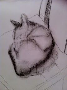
I chose cats to draw because I have family with cats and I also love them as a subject.  They were not so tricky as they sleep a lot but they would still be aware of me after a while and move.  I tried a technique I have learnt with drawing faces and that is to break down the subject into geometric shapes at the beginning before going to add detail.  This helps with animals as it enables you to get the outline and features in pretty much the right place before going for the detail.   

For the cats I used soft graphite,  charcoal and conte.   I like using these media as they lend themselves to drawing quickly and you can get a lot of coverage in a short space of time and also rub out highlights with a putty rubber.

To draw more animals I am thinking of visiting a part which has a lot of deer.  There is a small local farm too which has a variety of animals.   I will continue to draw the cats and also I have a dog coming to stay for 10 days soon and that will be such a good opportunity.  I haven't tried drawing a moving animal (apart from the fish above) and at the moment I wouldn't know where to start - but it is something I would love to do.

Sunday, 17 February 2013

Cats - Skeletal information/drawings


TWINKLE


MITZY


 MAGIC


TWINKLE IN CONTE


- Posted using BlogPress from my iPhone

Wednesday, 6 February 2013

Ben Nicholson 1894-1982

Find out about Ben Nicholson. Why does he simplify still life forms and negative space and superimpose them on the Cornish landscape?
Artist Ben Nicholson  1894-1982               
Nicholson was an influential English abstract painter.  The son of the painter Sir William Nicholson, Ben Nicholson briefly attended the Slade School of Fine Art in London in 1910–11, but was largely self-taught.  He began to paint seriously in the 1920’s, first creating still life’s and landscapes in a conventionally realistic style.
Nicholson’s interest in abstract forms of art was influenced by his extensive travels and encounters with cubism and the modern sculptural work of Barbara Hepworth (who became his second wife) and Henry Moore.
In 1933 he and Hepworth joined the Paris-based Abstraction-Creation group, an artists’ association that advocated purely abstract art. He also met the Dutch painter Piet Mondrian, under whose influence Nicholson’s work took on a greatly simplified geometry; typical of this period are his low reliefs of whitewashed circles and rectangles, such as White Relief (1937–38).
In the 1940s Nicholson returned to landscape and still-life themes, often painting simplified representations of still-life motifs within otherwise largely abstract compositions. In his later work he continued to shift between modes of abstraction and representation.
Ben Nicholson painted some of the best known abstract paintings in 20th Century British art. He and Barbara Hepworth moved to Cornwall during World War II and helped establish the important community of artists knows as the St Ives School. The area became famous for abstract painting and sculpture and had a major impact on modern art in Britain.
Sources: Britannica online, Wikipedia
Nicholson talked about abstract art as a freeing or liberating of form and colour in order to express an idea.  In his writings he talks of playing with ‘planes’ to create an impression or illusion of space.   He believed it was limiting to try and intellectualise abstract art.  He said ‘ I think that far from being a limited expression, understood by a few, abstract art is a powerful, unlimited and universal language’. 
I would say Nicholson simplified still life forms and negative space as part of his work to liberate form and colour and create space, by playing with planes.  He did this to capture the imagination of the viewer.  I expect he used the Cornish landscape in his work, as he was influenced by where he lived at that time and it must have inspired and influenced his work. 
Source : Ben Nicholson ‘Notes on Abstract Art’, Art in Theory 1900-2000, An Anthology of Changing Ideas, Edited by Charles Harrison & Paul Wood

Sunday, 3 February 2013

Still life composition of fruit/veg + check/log

I did a few rough sketches of banana, orange, apple and lemon compositions.  I liked the fact that a mix of the same colours featured in some way in each of the fruit and thought this might help the composition.  I felt it was a good idea not to bunch all the items too close together in the picture and despite doing that I think I achieved an impression of depth.  Also to add a plate or a knife helped the picture look more complete.  Also including the surface and background of the items being drawn gave better perspective and depth and reality to the composition.   The drawings below were done in pastel pencil.


The pepper, cucumper and lettuce were drawn with oil pastel.  I sort of gave up with the lettuce and it shows.


STILL LIFE CHECK AND LOG


Still life using line.. I liked focusing on line and then suggesting at form. I had problems in using an unalterable medium so mistakes couldn't always be made good. I like the graphic and simple nature of this type of still life though I think I need to get better at drawing simple lines and shapes to make it work.

Still life in tone - I liked this excersie, transposing tone with different colours. The problem I had was keeping to the 'key' and keeping concious of trying to indicate tone (light and shade) by using colour. But I think the end result is interesting to look at.

I feel I did get a sense of depth in my drawings by including an element of background. A setting. It also helped to group items together where they were in front or behind each other, though not too closely bunched up.

I think drawing using just line or just tone did raise issues of how I would depict the subject matter but that question arises with each different medium you use and for me that challenge is something I enjoy.

I do feel I am more interested in getting the impression of the subject rather than the overall composition. I note the guidance that the composition should occupy most of the papers surface though I don't think I necessarily fulfilled that but adding background did help. Though I understand the composition should dominate.

Regarding my learning from drawing the details fo fruit and vegetables. I think focusing on plains really helped me. To look for the plains helped a great deal in achieving the right shape of individual subjects.

The thing I find most challenging about this part of the course is my (probably misplaced and uninformed) lack of interest in still life! I do love the challenge of drawing anything but I find that I have an attitude about buying interesting shaped fruit and veg or plants (which can be expensive) then arranging them in an interesting composition (though I don't find it interesting) then drawing it before every goes off. I think my idea of drawing from nature involves getting outside and drawing nature, or animals inside or out. That sort of thing. But I do appreciate the benefits of drawing still life and thinking about composition and setting up lighting to practice everything you need to practise in order to draw from nature whereever you are. It is about creating the chance to observe in a controlled set-up way and that allows time to observe and learn.

Still life using markers or dip pens

I really liked using markers.  I had a small range of colours with different width nibs on each end.   Had I had a bigger colour range I would have used markers for my final piece for assignment two.  I will definitely use them again.  I liked the simplicity of overlaying them.  It was necessary to think before every mark because they are not removable - but that was a challenge I liked.


Drawing fruit and vegetables in colour/drawing using oil pastel

Not easy to hatch with crayon/oil pastel but I like the effect.
I scraped off some lines with toothpick after.
 
   
Below, felt tip and fineliner.  Hard subject as seperate plains not easy to 'see'.
Pastel stick/pencil.  Definite plains along banana shape made this easier to draw than other subjects.  Pastel pencil/stick good to hatch with as with orange, kiwi and lemon.   I think using orange and blue ballpoint pen for second orange, worked well. 


Still life group in tone


I did understand and like this idea of using different colours to depict different tones. However I did sometimes forget the rule at times during the process, and got lost in just enjoyed the drawing.  I used pastel and in the second picture I show its development.
 

Detailed observation check/log and Research into two artists

So far I have found the following:

- pencil is best for hatching and pen best for dots/stippling.  Both work for line.
- Hatching and stippling work well to create tone.  I found stippling and line work well to create pattern and texture.
- I did enjoy capturing detail but at times I found it frustrating and I do tend to give the impression of what I see rather than a literal drawing.  I believe I am more inclined to draw large and less detailed though I havent practised this a lot.
- Though I was focusing on one subject at a time in this section, I feel its good to draw more than one of the same thing, for example a few leaves or two halves of a cabbage.  One solitary item on a page isn't as good. 

Research Point : Find drawings by two artists who work in contrasting ways, from tight, rigorous work to a more sketchy, expressive style

I looked up Lucien Freud whose life and portrait work I find interesting.  I wanted to see if I could find any drawings from nature by him.  There was a news article about some of his drawings which are up for auction at Sothebys and Christies soon.  These included :

Gorse Sprig  1944  Coloured Pencil and Crayon


Cacti and Stuffed Bird 1943  Pencil and Crayon


In his early work it seems Lucien Freud worked in a rather tight and controlled, detailed way.  At least these two drawings show that. 

It was hard to find a well known artist drawing nature in an expressive way.  I came across Ellsworth Kelly an American painter who is best known for his big, bright abstract paintings. Less well know however are his figurative drawings of plants and flowers.  Here are two examples.  I would call them more sketchy and expressive.

 
Daffodil 2004
 
Teasel  1949  Brush and Ink with dry stulus on paper